Craigslist Redesign
The purpose of this project is to enhance the user experience of the Craigslist website, a online marketplace that allows users to buy, sell, and trade goods and services. The objective is to design a new, user-friendly interface that simplifies the process of searching, posting, and navigating on the platform.
Role
- UI/UX design
Deliverables
- Wireframe
- Redesign
Tools
- Figma
Background
Craigslist is a well-established online classifieds platform that enables users to post and browse local advertisements for buying, selling, and trading goods and services. It has garnered a large following due to its convenience and free-to-use model.
However, despite its popularity, the platform's interface design has remained largely unchanged for over 25 years, leading to a somewhat dated look and feel. While this can create a sense of familiarity for long-time users, it may also contribute to an outdated impression for potential users.
To gather insights into the impact and user perception of the Craigslist website, I conducted online research using a variety of mediums and sources, including articles and user feedback.
After conducting research on user perception and impact of the Craigslist website, several drawbacks were identified in its interface design. In response, the proposed redesign aims to meet the goals set out to address these issues.
Assumptions
- 01
Craigslist users are accustomed to and prefer a minimalistic and straightforward design. - 02
Craigslist users visit the site with a clear purpose in mind, whether it is to buy or sell a specific item or service. - 03
Craigslist users may find it difficult to locate what they are searching for due to the extensive navigation. - 04
Craigslist users perceive the platform to be unsafe with concerns about the reliability of other users.
Feedbacks

"I like the no-frills approach of Craigslist. The website is easy to use."
"I appreciate the simplicity of Craigslist's design and layout that they prioritize usability over aesthetics."
"Although I've been using Craigslist for a while, I think the design is outdated and needs to be more modernized."
"I often find myself spending too much time trying to find what I'm looking for on Craigslist due to its inefficient navigation."
"My experience with unreliable users on Craigslist has made me cautious. It would be great to see improvements to the platform's safety and security."
Problem Statements
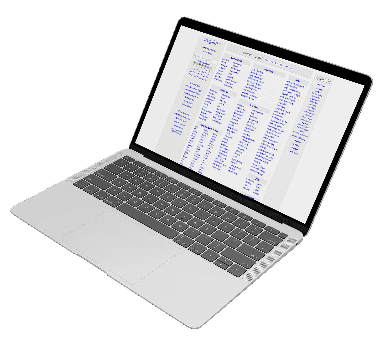
- 1 The website's layout is too cluttered, with insufficient white space.
- 2 Overwhelming number of options make it difficult to navigate the website.
- 3 The search bar's placement is unusual, and it has limited functions.
- 4 Users express safety concerns due to the prevalence of unreliable users on the site.
- 5 There is a lack of calls-to-action (CTAs) and no clear indication of clickable buttons.
Project Goals

Search Function
Enhance the search function by adding relevant search filters.

Navigation Process
Streamline navigation by establishing a clear visual and content hierarchy.

Clear Layout
Develop more user-friendly design layout for viewing content from listings.
Low Fidelity Wireframes
Final Website
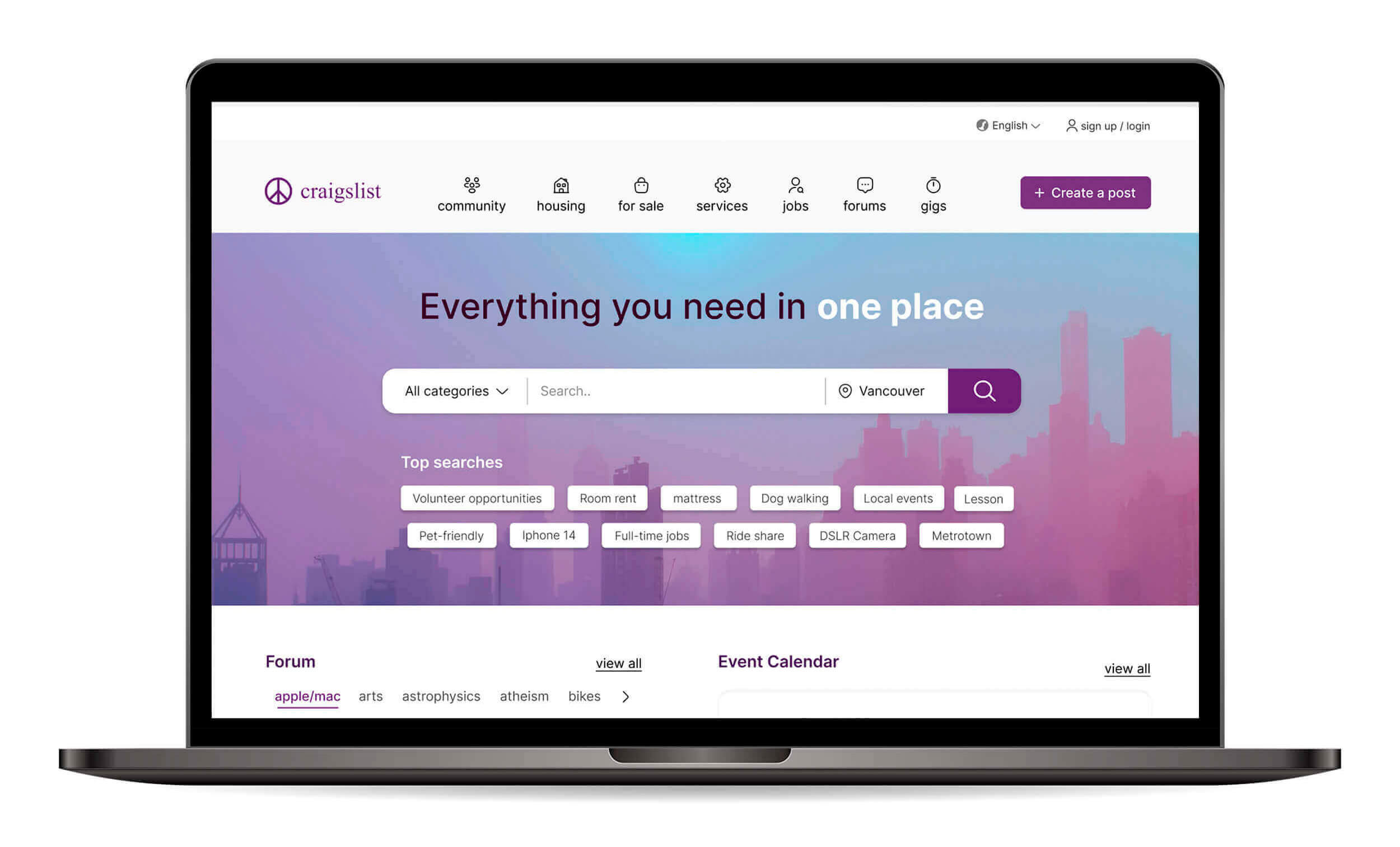
User friendly Navigation with Clear Calls To Action
The redesigned website features clear calls-to-action that guide users in performing the desired actions without confusion. The most used features, such as the searching and posting buttons, are highlighted with the primary color to stand out. Navigation has been designed to be less overwhelming and now includes a prominent search bar, making it easier for users to locate what they need with ease. Matching icons have been added to make navigation items more recognizable and accessible. The search bar on the top includes basic filters for location and categories as optional to make searches more relevant.
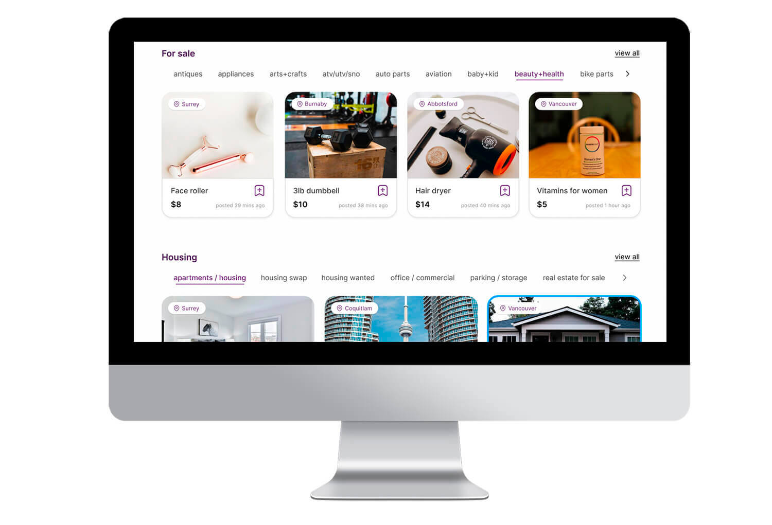
Simplified and Modern Layout
The website has undergone significant simplification, resulting in a more straightforward browsing experience for users. The home page now features popular categories, with interactive images showcasing the most recent postings and adding dynamism to the browsing experience. Each card includes essential details about the post, such as the sale price for sale postings and the employment types for job postings, ensuring that users have all the necessary information at their fingertips.
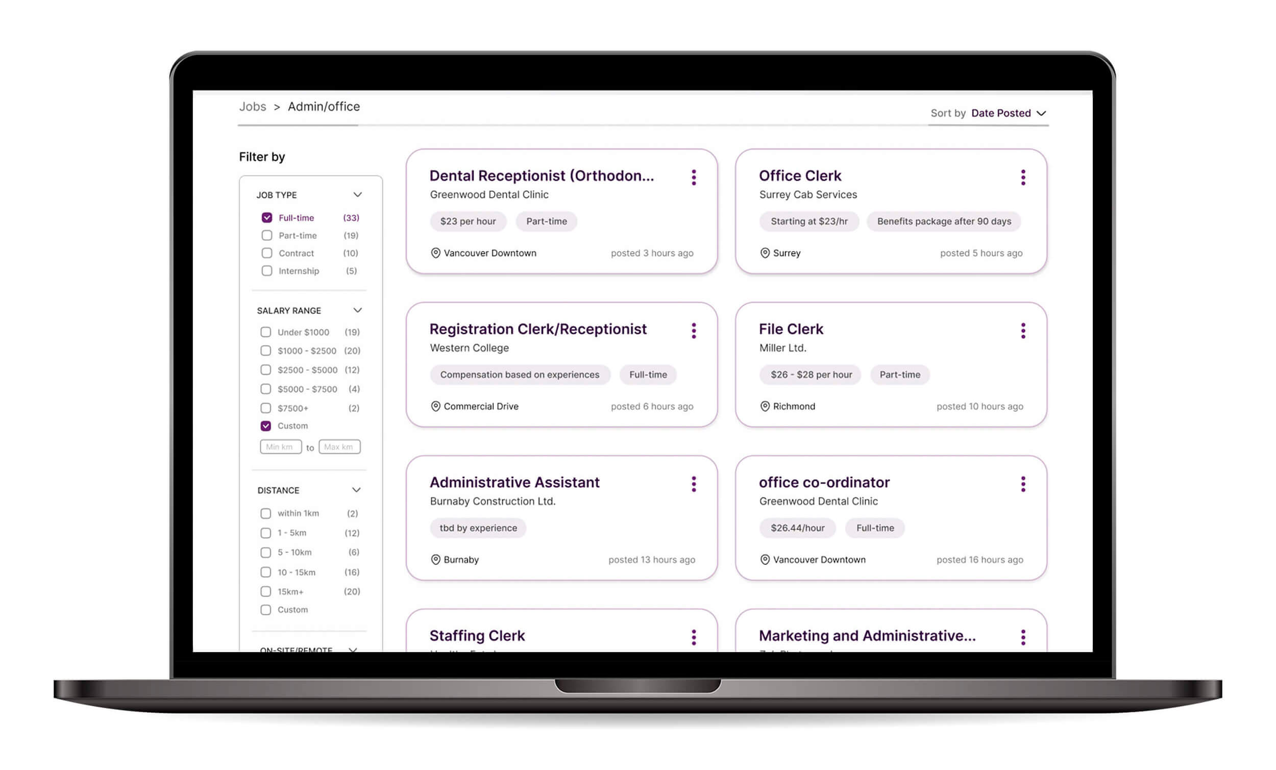
Meaningful Search Filters and Less Cluttered Search Page
The search page has been revamped to include more relevant search filters, such as salary and job type for job search. The previous cluttered design has been updated with a new card layout that creates distinct borders between elements, resulting in a more breathable and legible design. The kebab menu, represented by three dots, is included in each card and provides the option to share, favorite, or hide the content.
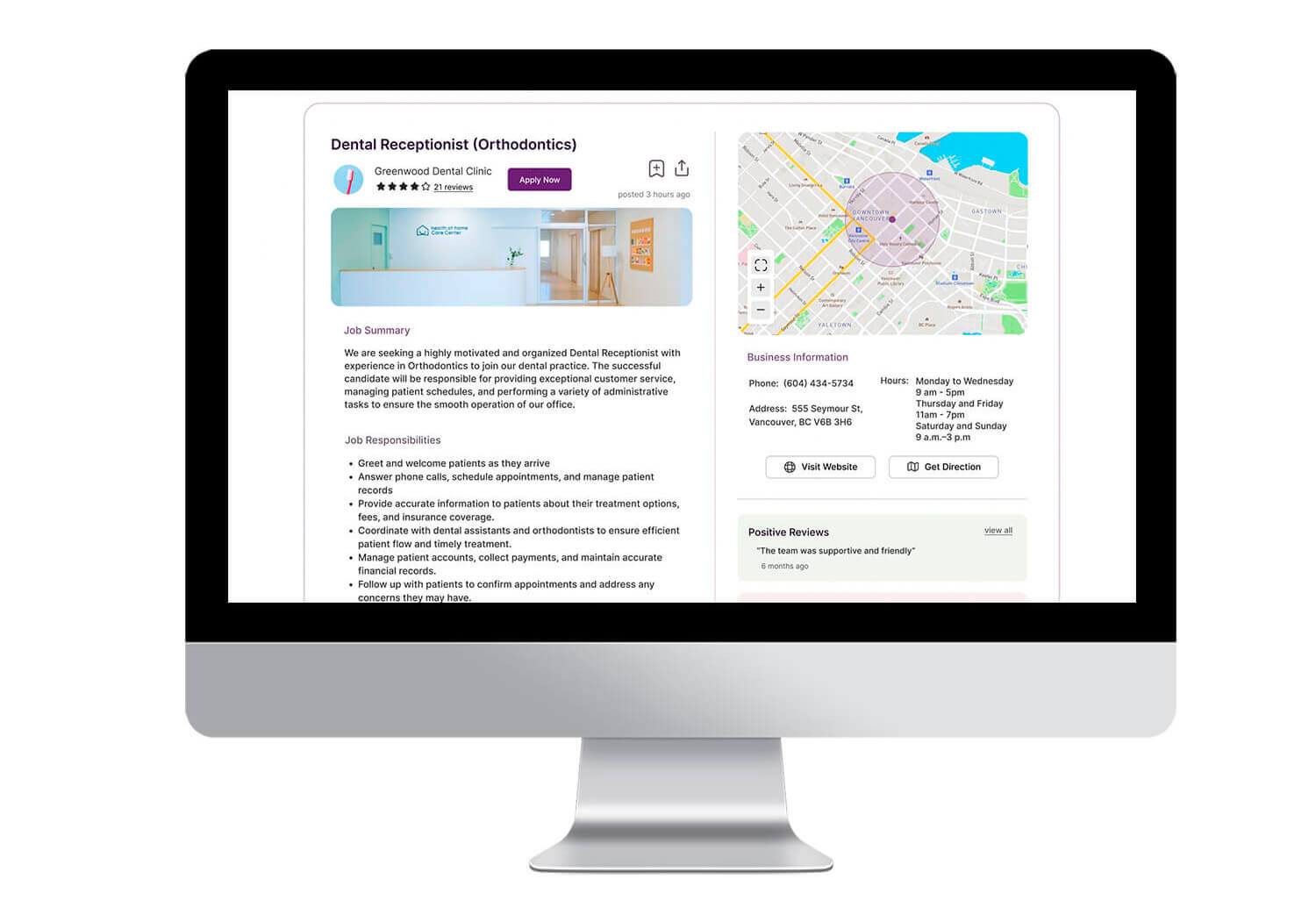
Improved Reliability with User Ratings and Reviews
The listing page has been improved with a focus on effective organization and presentation of content. Each listing includes a prominent call-to-action button that allows users to easily contact the seller or employer. Specific employer information, as well as map and link buttons, have been added to each job listing to enable users to obtain directions or visit the business website with ease. In response to user concerns about safety and reliability, a user rating system has been introduced, allowing job seekers and buyers to view the ratings of potential employers or sellers. This feature gives users more comprehensive information to make informed decisions.
View Other Projects:
