Landmark
This case study focuses on evaluating the user experience of Landmark Cinemas, a well-known Canadian cinema chain. It employs interviews and various metrics to assess the Landmark website. The goal of the study is to address user challenges by providing design solutions that identify and resolve user pain points.
Role
- UI Design
- Information Architecture
- User Research
Deliverables
- User Study
- Wireframes
- Solutions
Tools
- Figma
Brand Background
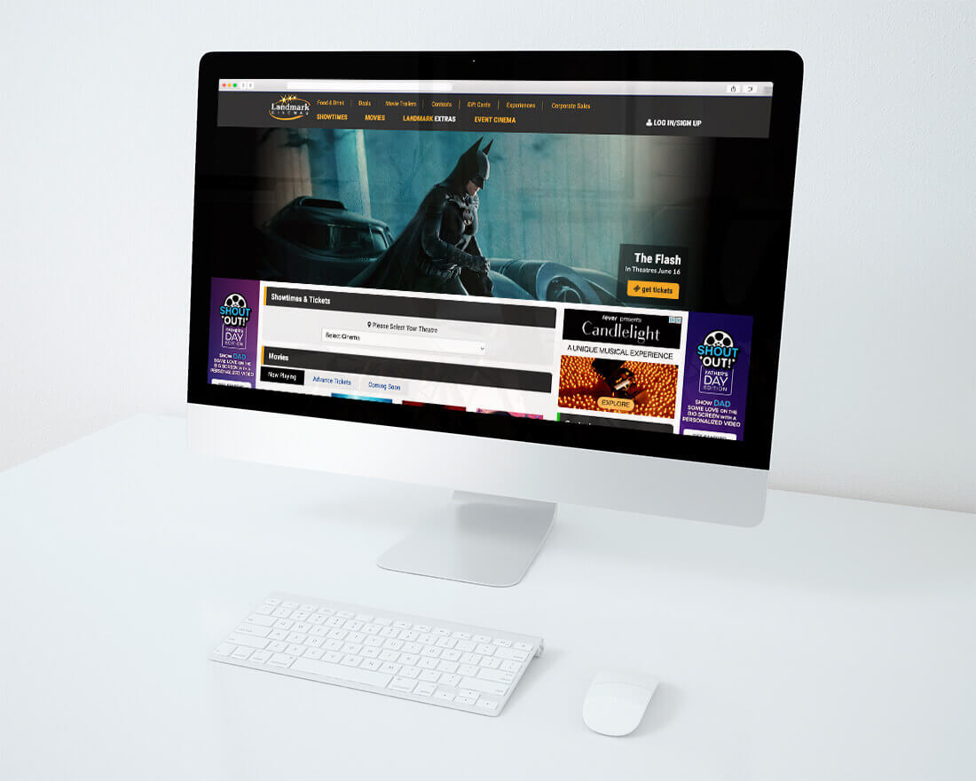
Acquired in December 2017 by Kinepolis Group NV, Landmark is Canada's second-largest cinema company with 39 locations and 317 screens.
Landmark Cinemas offers diverse movie experiences, including Laser Ultra, RealD 3D, IMAX®, Extra, and Xtreme screens. Some locations provide premium comforts like Premiere or Full-Recliner Seating, with free reserved seating.
In response to the growing demand for online movie ticket purchases, Landmark Cinemas has launched two platforms: the official website and mobile app. They allow users to browse movie listings, check showtimes, and view available seats at specific locations.
Problems
Despite its intention to provide users with a convenient platform for activities such as viewing movie details and purchasing tickets, the Landmark website has faced significant business challenges.
To address these issues, our team conducted thorough user research to pinpoint specific pain points in Landmark's user experience and interface design. Based on our findings, we have developed actionable solutions to rectify these concerns and improve the overall user experience.
- 01
High bounce rates on landing page - 02
Low conversion rate for online ticket sales
Note: A fictitious scenario has been used for the purpose of this case study.
Goals
The primary objective of this UX case study is to identify practical solutions that can effectively address the issues of the high bounce rates on the landing page and the low conversion rate for online ticket sales on the Landmark Cinemas website.
Key Hypotheses
Based on the business problems identified, we came up with 3 key hypotheses to test:
Participants
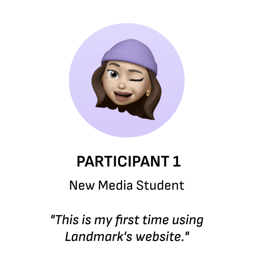
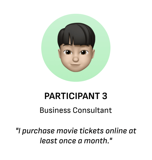
We had a pool of 15 people who filled in screening questionnaires, and based on their responses, such as availability for testing and experiences with the Landmark website, we selected four participants. These four participants had diverse backgrounds, experiences, and other characteristics.

Method
The user studies involved in-person testing conducted under moderation, with simultaneous recording via Zoom. Moderators followed pre-created task cards to guide participants through a series of tasks and questions pertaining to the Landmark website. Towards the end of the study, participants were requested to complete a SUS questionnaire regarding the website.
After each session, two observers reviewed the recordings of each user, taking notes on the study and highlighting common observations. The main objective of these observations was to identify patterns in user behavior and validate or invalidate the hypotheses.
Task Cards
Task 1
Task 1 aimed to gather insights into participants' perceptions and interactions with Landmark's landing page. In the first step, participants underwent a blink test, comparing Landmark's landing page with that of its main competitor, Cineplex. They provided impressions of both pages and selected their preferred option.
Step 2 involved participants reviewing Cineplex's landing page and indicating their preference. In step 3, participants were tasked with finding movie options for a specific date and location on Landmark's landing page. Moving on to step 4, participants were asked to locate a 3D movie after setting the desired location and date.
Observations
Task 2
The second task was designed based on the screening question results. Participants were asked to identify the most important factors when selecting a movie and theatre. The top responses were location, price, movie selection, and genre/cast/director. The task aimed to assess if the website provided easy access to these information.
The task consisted of three steps. In the first step, participants were required to locate a specific movie and retrieve detailed information about it. In the second step, participants had to find a movie trailer. The final step involved finding the ticket price, which could be accessed by clicking on the location under the showtime section.
Observations
Task 3
Task 3 was designed to compare how users would locate a specific movie on the Landmark website compared to the Cineplex website, determine their preference between the two, and understand the reasons behind their preference.
In the first step, participants were asked to find a specific movie on the Landmark website, even though it was not currently showing but scheduled for release in the near future. In step 2 of the task, participants were then asked to locate the same movie on Cineplex's website.
Observations
System Usability Scale
By utilizing the System Usability Scale (SUS), we were able to gain a deeper understanding of the participants' experiences and satisfaction levels with the Landmark website.
While participants who were more familiar with using the theatre website achieved higher SUS scores, the majority still expressed dissatisfaction with its usability. Consequently, the website received an average SUS score of 25 and a detractor Net Promoter Score (NPS), indicating room for improvement in enhancing the overall user experience.

Key Findings
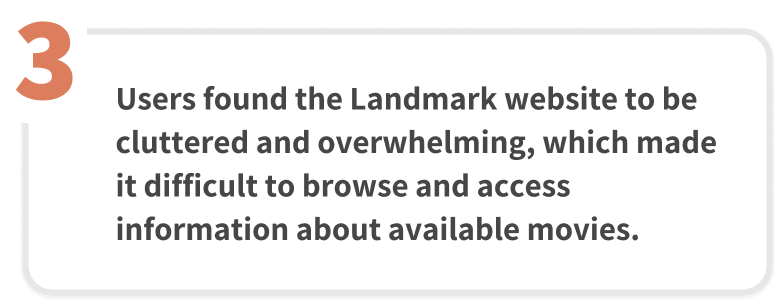
Based on the user study conducted, there were 3 significant findings that emerged consistently from all participants. These takeaways provide valuable insights into the user experience and highlight areas that require attention and improvement.
Recommendations
Drawing from key insights gathered during the analysis, we have devised targeted and effective solutions to address the problematic areas within the website.
-
Solution 1Simplify main navigation and use dropdown menus to indicate information hierarchy.
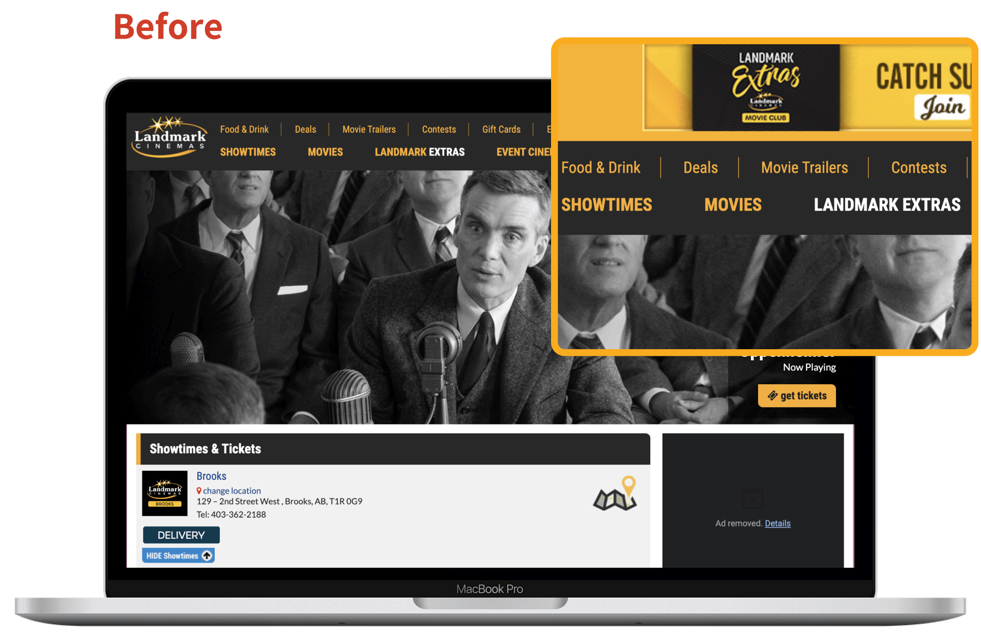
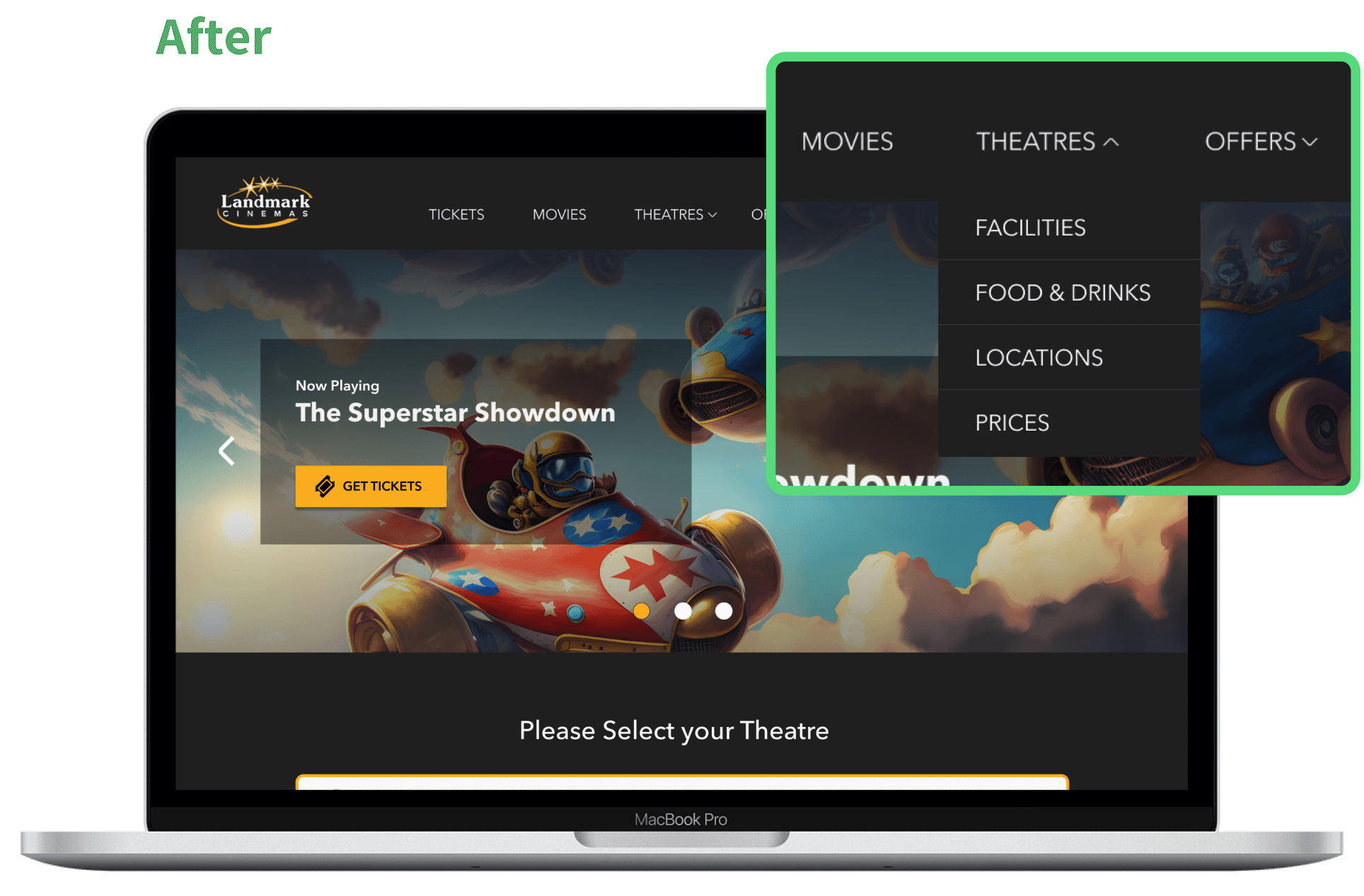
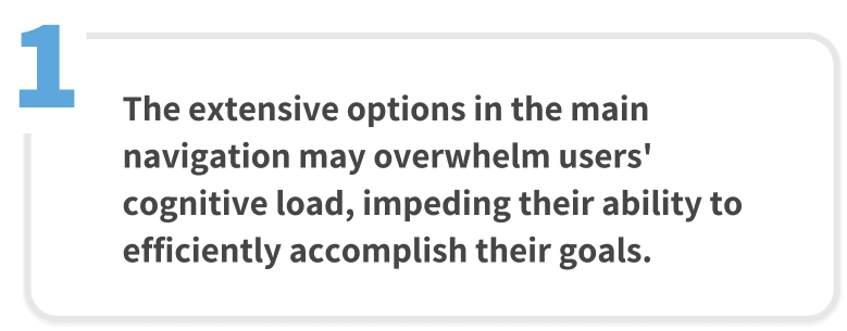
To address the issue of users feeling overwhelmed by the main navigation, we implemented several measures. Firstly, we reduced the number of global navigation items from 11 options to just 5 options.
Additionally, we introduced hover-activated dropdown menus to display the sub-navigation, allowing for more intuitive categorization of information under main headings. Lastly, we implemented a fixed header, ensuring that users can access the navigation menu easily, regardless of their location on the site.
-
Solution 2Include search feature for both movie and location to allow more accessible and intuitive navigation.
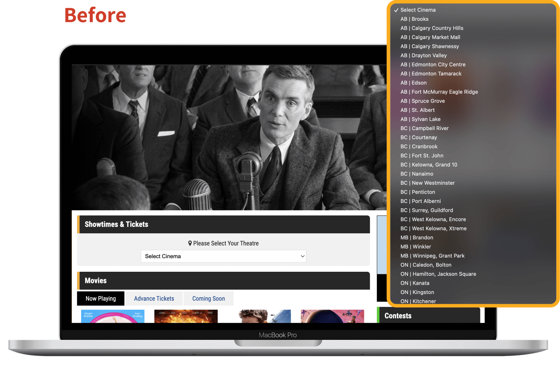
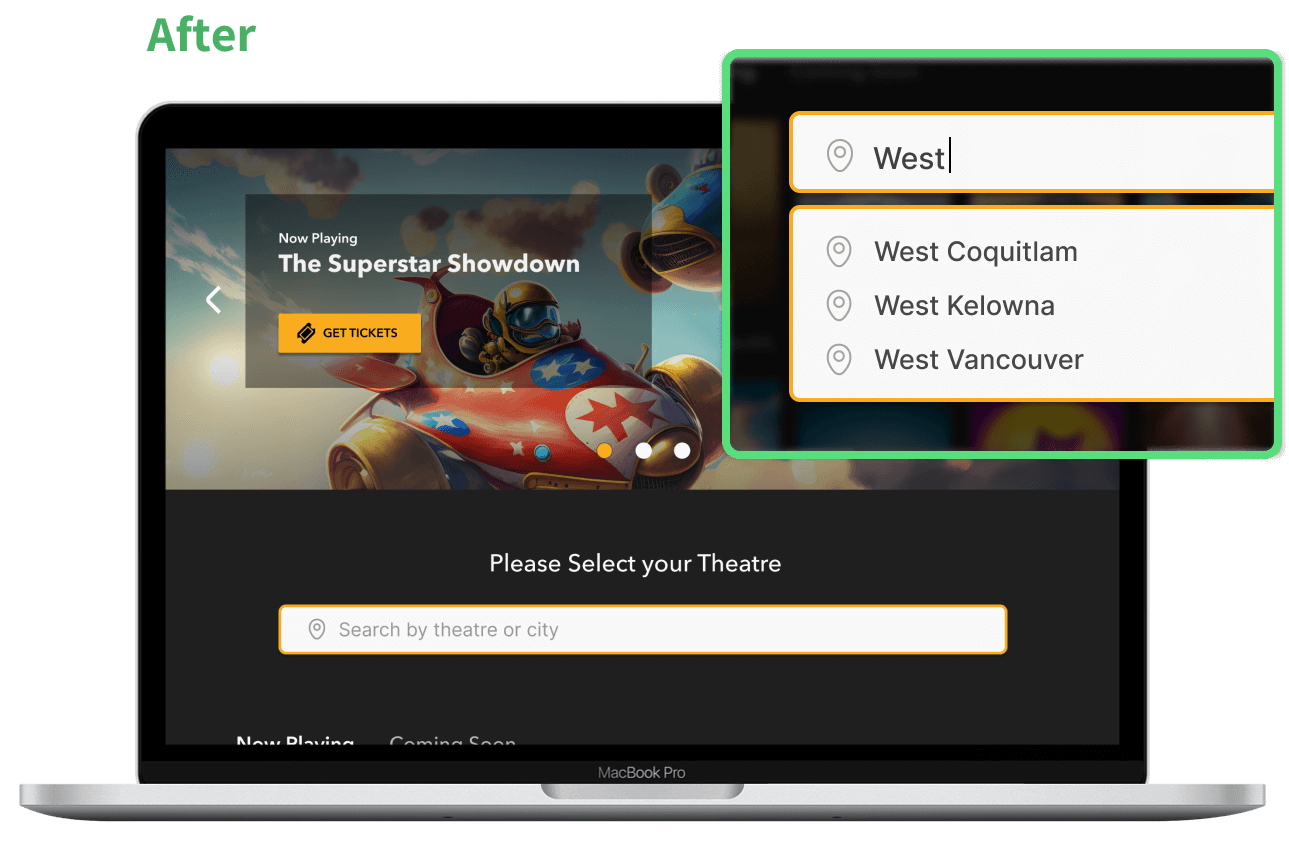
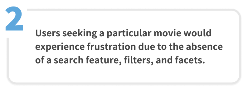
To resolve user frustration caused by the absence of a search feature, we implemented the following enhancements:
Firstly, we incorporated a search icon into the main navigation, granting users convenient access to the search functionality. Additionally, we introduced a search input option on the landing page, specifically catering to users who prefer to search for movies based on location.
-
Solution 3De-clutter ticket purchasing process and focus on the essential steps to streamline the purchasing flow.
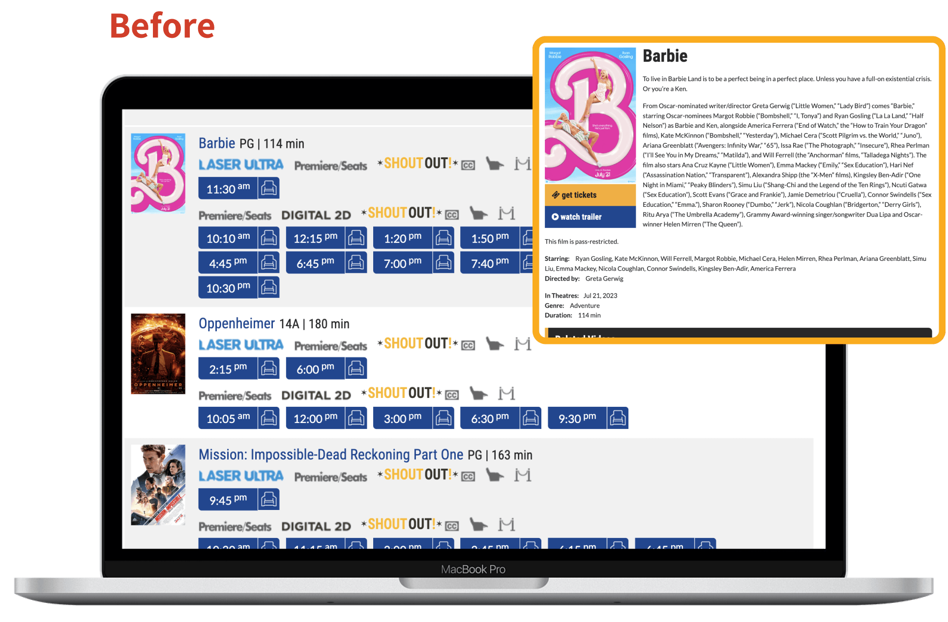
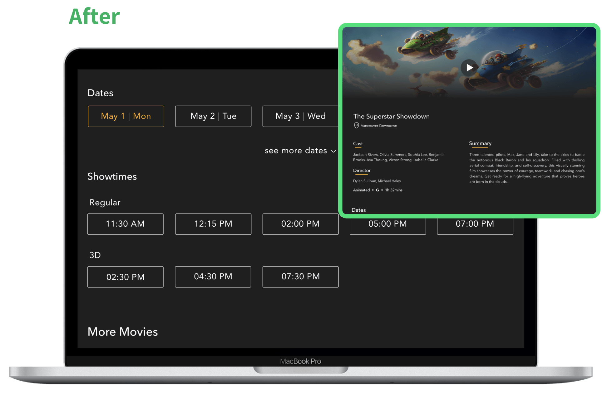
Based on user research findings, we simplified the ticket purchasing process. Users had difficulty finding and setting their desired location before selecting a movie. Additionally, the icons displayed under movie titles needed improvement in terms of user-friendliness and readability.
To address these issues, we redesigned the ticket purchasing flow. Now, when users click on a movie poster, they are directed to the movie detail page. Here, they can first view the introduction and trailer, and then select their preferred date. The corresponding showtimes are displayed once the date is chosen. Furthermore, users have the option to browse other movies at the bottom of the page if they are unsatisfied with their initial selection. This eliminates the need for back-and-forth navigation to explore different films.
Final Redesign
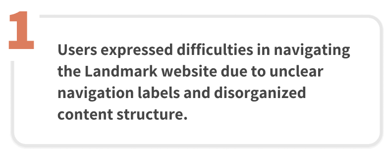
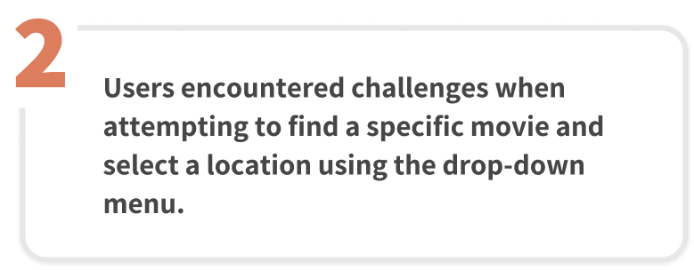
During our usability test of the Landmark website, we discovered several noteworthy issues related to search and navigation, information architecture, categorization, and the overall user interface. In response to these problems, we have undertaken a redesign of Landmark's website to resolve these issues, as they were causing confusion among our test participants and impeding their ability to accomplish essential tasks. Some of the key challenges faced by users included:
- Searching for a specific movie
- Locating information such as tickets, pricing, showtimes, and location
- Navigating the website using the primary navigation
What I learned
The Landmark case study provided me with valuable insights into user experience design. Firstly, I understood the importance of being cautious when utilizing icons or graphics to convey information since different users may interpret them differently. For effective communication on a website, clear and familiar labels play a crucial role.
Another important lesson I learned is the significance of choosing appropriate interactive elements based on the context. For example, when there are an extensive array of options to choose from, a drop-down menu can be overwhelming for users, making a search function a more suitable alternative.
Lastly, I gained an understanding of the significance of a well-structured information architecture. A robust information architecture facilitates easy navigation and interaction with the web interface, preventing users from getting lost or confused, which was a challenge faced by Landmark's website due to its vague information hierarchy.
View Other Projects:
