W!ser
W!ser is a fictional multi-brand e-commerce platform that sells a wide range of skincare products. The project highlights a range of features aimed at optimizing the entire shopping process, from creating an account to making a purchase.
Role
- UI/UX Design
- Interaction Design
- User Testing
Deliverables
- Personas
- Userflow
- Prototype
- Usability Test
Tools
- Adobe XD
- Adobe Illustrator
- Adobe Dimension
- Useberry
Research
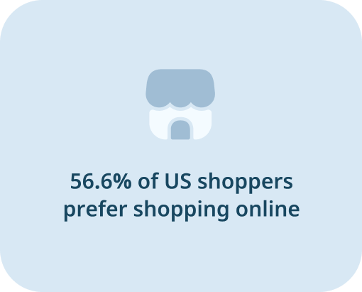
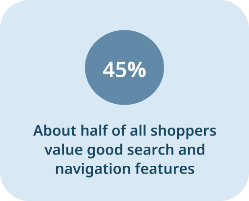
Over the last few years, there has been a substantial surge in the popularity of digital shopping. According to Phase 5’s Canadian Online Shopper Study (May 2022), “In 2022, the average Canadian online shopper placed 26.4 e-commerce orders – up 60% since 2019
I conducted a research and user interviews to pinpoint the common challenges faced by customers of both brick-and-mortar stores and ecommerce websites. After analyzing the results of my research, I identified the four most frequently mentioned pain points among both brick-and-mortar and ecommerce customers.
Challenge
Retail Store Customers
- Difficulty Comparing the Prices
- Difficulty Locating the Products
- Lengthy Checkout Queues
- Limited Payment Options
Ecommerce Users
- Slow Checkout Process
- Lack of Relevant Information
- Poor Filtering Options
- Confusing Site Navigation
#1 Searching
#2 Information Architecture
#3 Checkout
User Persona
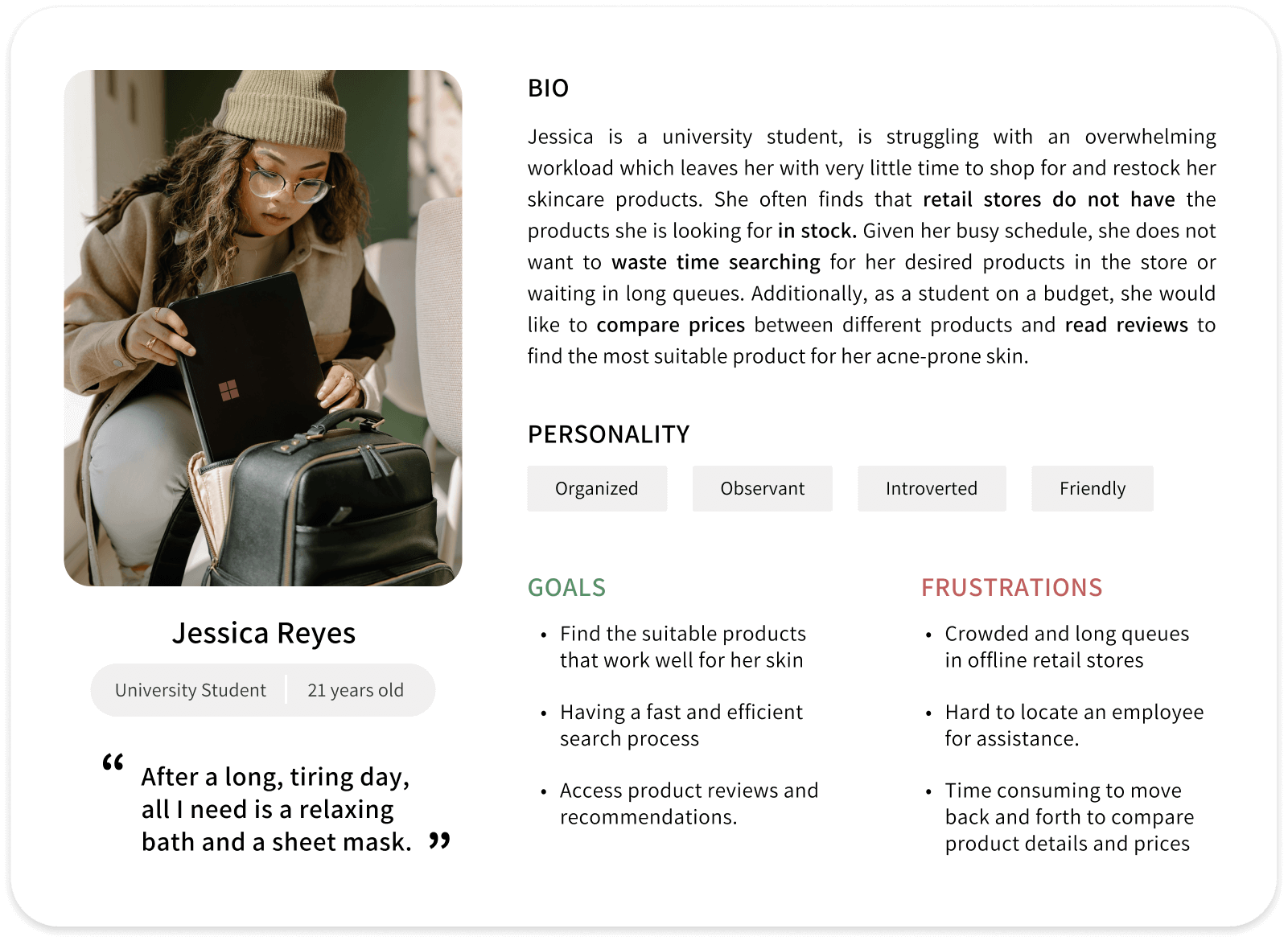
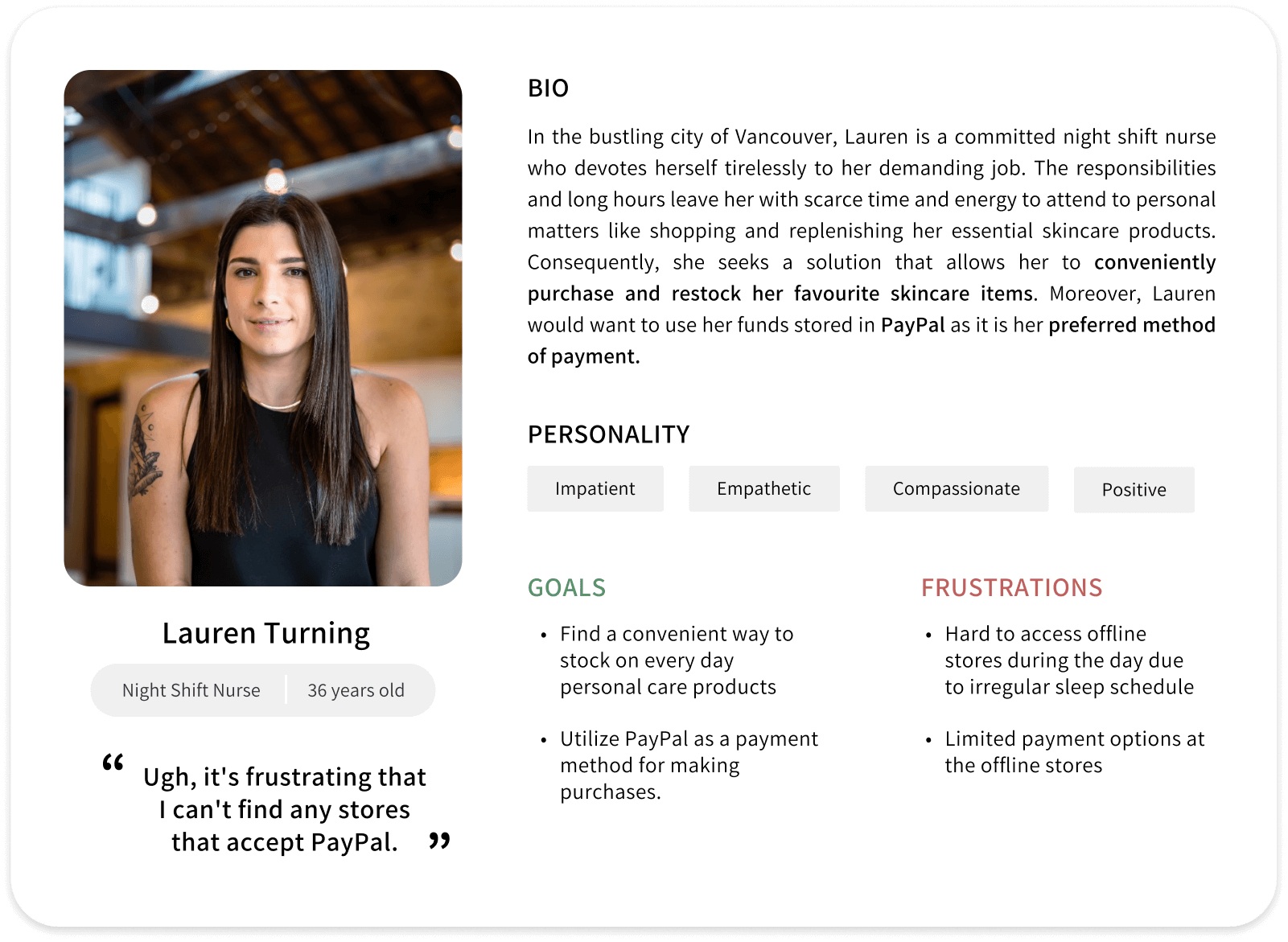
Based on the responses from interviews and online research, I noticed several common patterns among users, such as challenges in finding specific products, difficulties with the payment process, long waiting times, and uncertainty about product efficacy. To address these issues and create a more effective and user-friendly app interface, I developed personas to gain deeper understanding of the goals and needs of the ideal user.
- Users generally prefer detailed product information with descriptions, specifications, images, and customer reviews.
- Most users encounter difficulties when there are limited payment options available.
- Users often want the ability to review their order before proceeding with it.
- Users require a robust search filter that enables them to find the product they need quickly.
- Users need a clean and intuitive interface that is easy to navigate.
- Users need a faster way to complete the checkout process.
Userflow
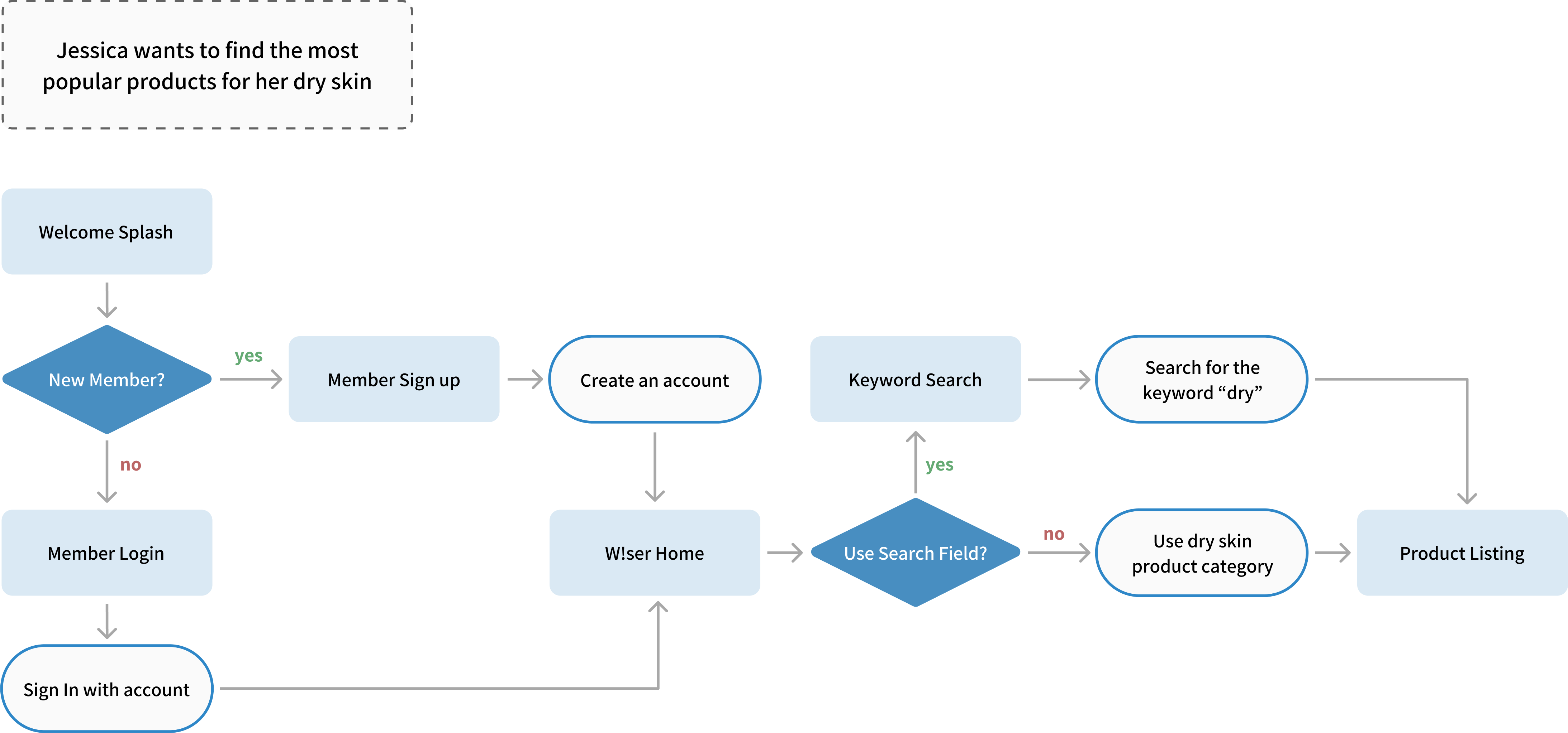
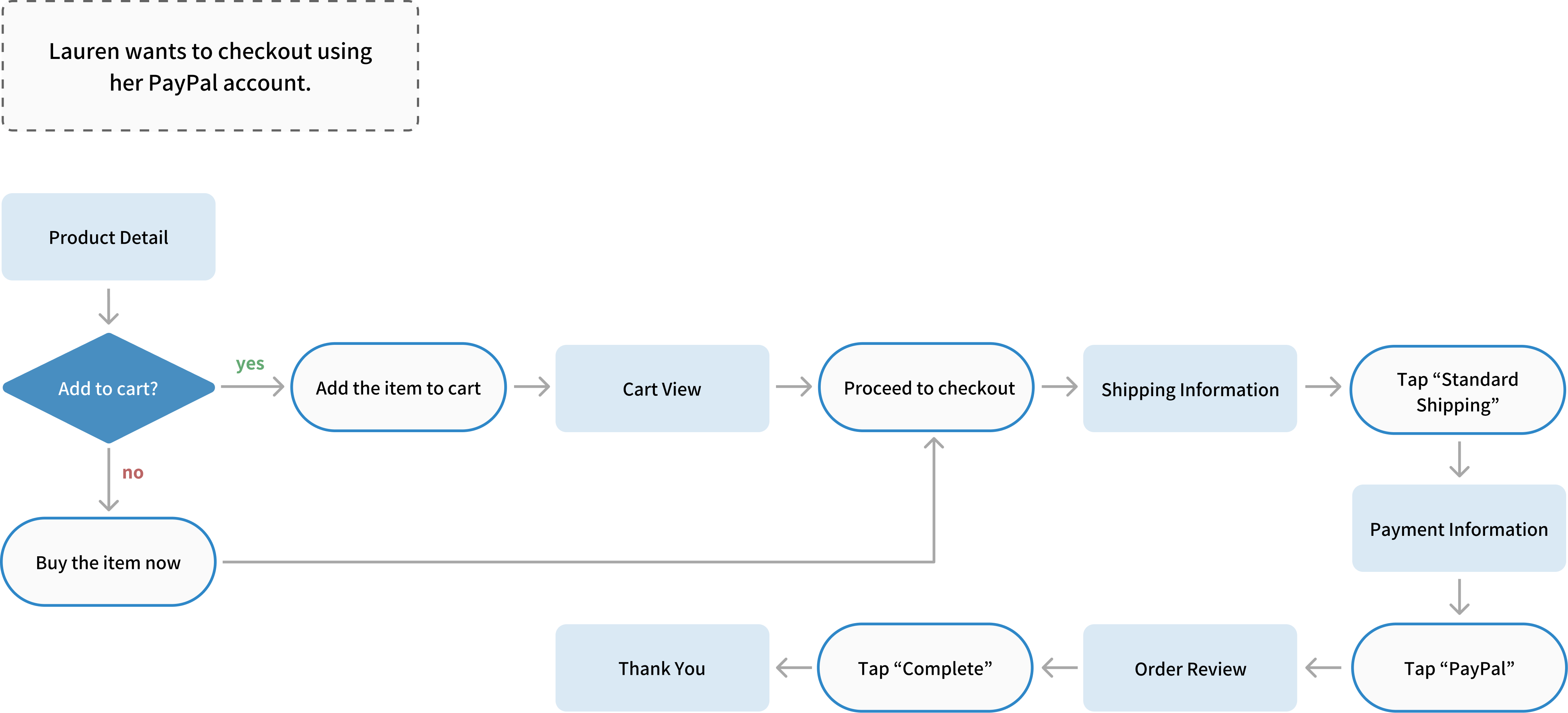
I developed user flows that aligned with the established user scenario. User flow helped me anticipate and plan for the various actions that users might take based on their experience with the W!ser app.

Style Guide
Logo
i in the word "wiser" is flipped to create exclamation mark

Color Palette
Primary 1
Primary 2
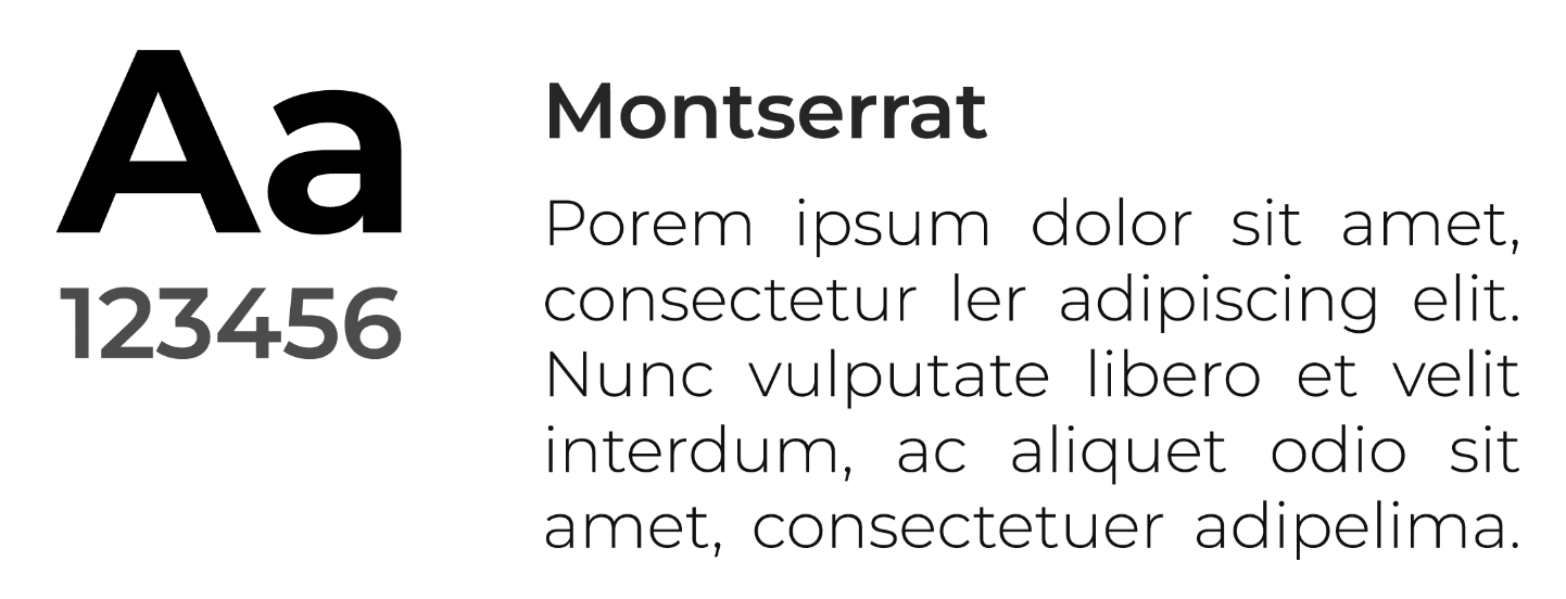
Tyography
Low Fidelity Wireframes
Taking the user flow and personas as a basis for my ideation, I created low-fi wireframes to visually represent the structure of the app interface.
High Fidelity Wireframes
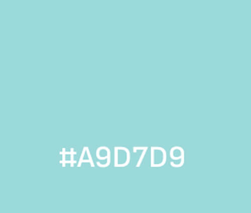
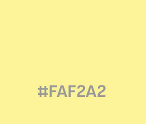
To enhance the user experience, the interface of the skincare app was designed with a focus on creating a bright and clean look and feel. The predominant colour scheme used is light and refreshing, with the addition of pastel green and yellow to create a sense of vibrancy and energy.
These colours have been strategically selected as point colours to highlight key features and ensure easy navigation throughout the app. The overall design is intended to be aesthetically pleasing and intuitive, providing users with an engaging and enjoyable experience while using the app.
App Features
1. Pre-categorized Categories
Upon initial entry into the home screen, users are given a variety of pre-defined categories that aim to facilitate their shopping experience and expedite the browsing process.
By having pre-categorized categories, users can quickly and easily navigate to the specific category they want without having to spend time searching through a large list of products.
2. Advanced Search Functions
Camera and voice search provide a more convenient and faster way to find products. Instead of having to type in search queries, users can simply take a photo of the product they want or speak the product name, and the search engine will find the closest match.
These search functions can also help user who may have difficulty typing or navigating a touch screen, such as those with physical disabilities or visual impairments. The goal is to make the search process more intuitive and accessible for all users.
3. Faster Checkout
To streamline the checkout process and offer greater convenience, users have the option to use the "Buy Now" button if they only wish to purchase a single product. This feature helps to simplify the purchasing experience, as users can bypass the cart and checkout process and proceed straight to payment with just one click. This is particularly beneficial for those who are in a hurry or looking for a quick and seamless buying experience.
4. Detailed Product screen
For users who seek detailed product information, this app is highly beneficial, as it provides an extensive amount of information about each product. In addition to product descriptions, users can access information about who the product is suitable for, as well as reviews written by other users. This can help users make more informed purchasing decisions and ensure that they are selecting products that are well-suited to their needs.
Usability Testing
The purpose of this usability test was to identify potential issues in navigating the app and understand their needs to improve user performance and satisfaction. The prototype interface was evaluated remotely by 10 participants through Useberry. They are assigned a specified set of tasks to perform and then asked post-session questions regarding their experience with the app.
Findings
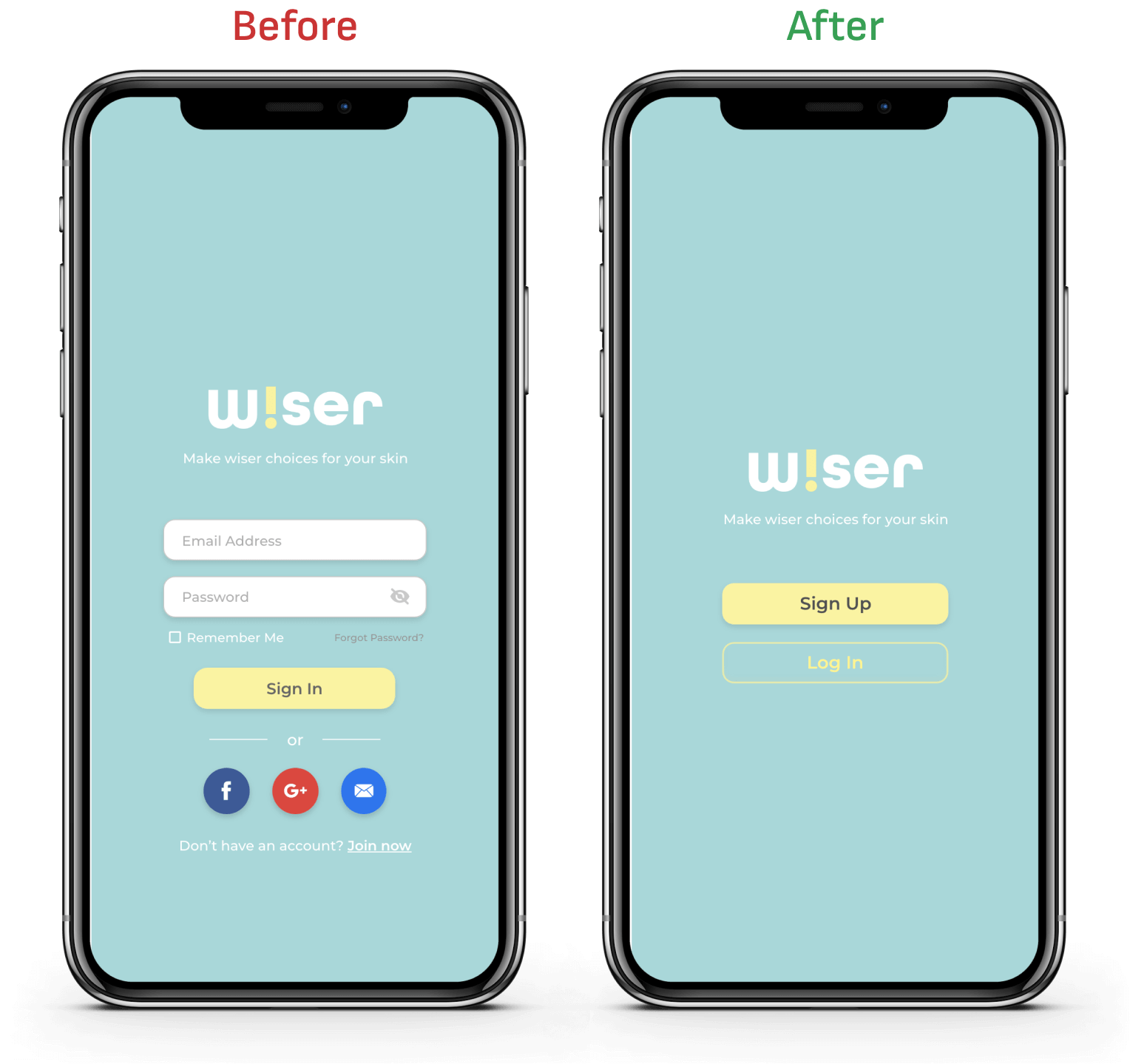
1. Design more clear sign up/login page
Users could perhaps have navigated more efficiently if sign-in and sign-up options were readily distinguishable. The first sign-in/sign-up process had been redesigned to appear less clustered. The sign-up button is now more visible to the users, unlike the initial design where it was in smaller text at the very bottom of the screen.
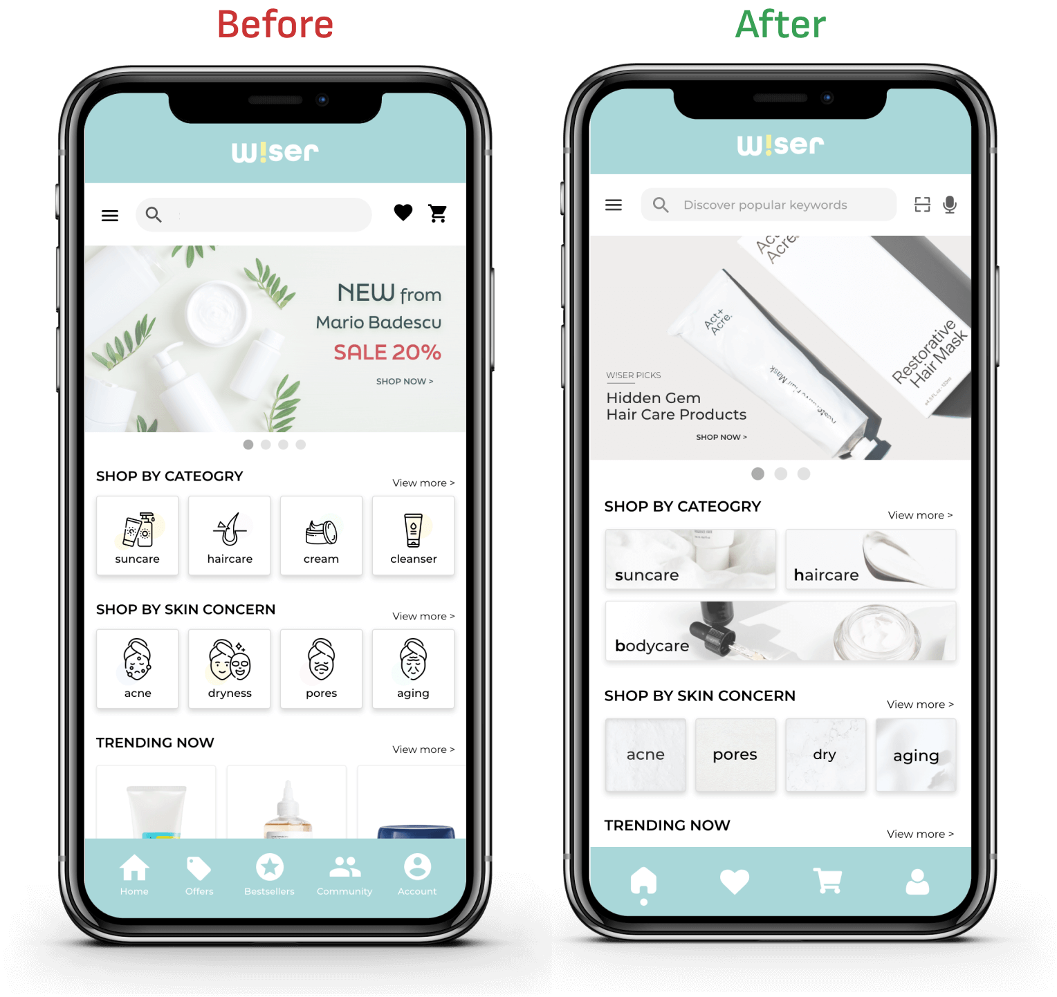
2. Users couldn’t find popular search keywords
A task where it required participants to find the most popular search keywords had a poor efficiency rate. Most participants clicked on trending now category or the menu to perform the task rather than utilizing the search bar which suggests popular searches. A visual cue has been implemented to direct people to click the search box and view popular search keywords.
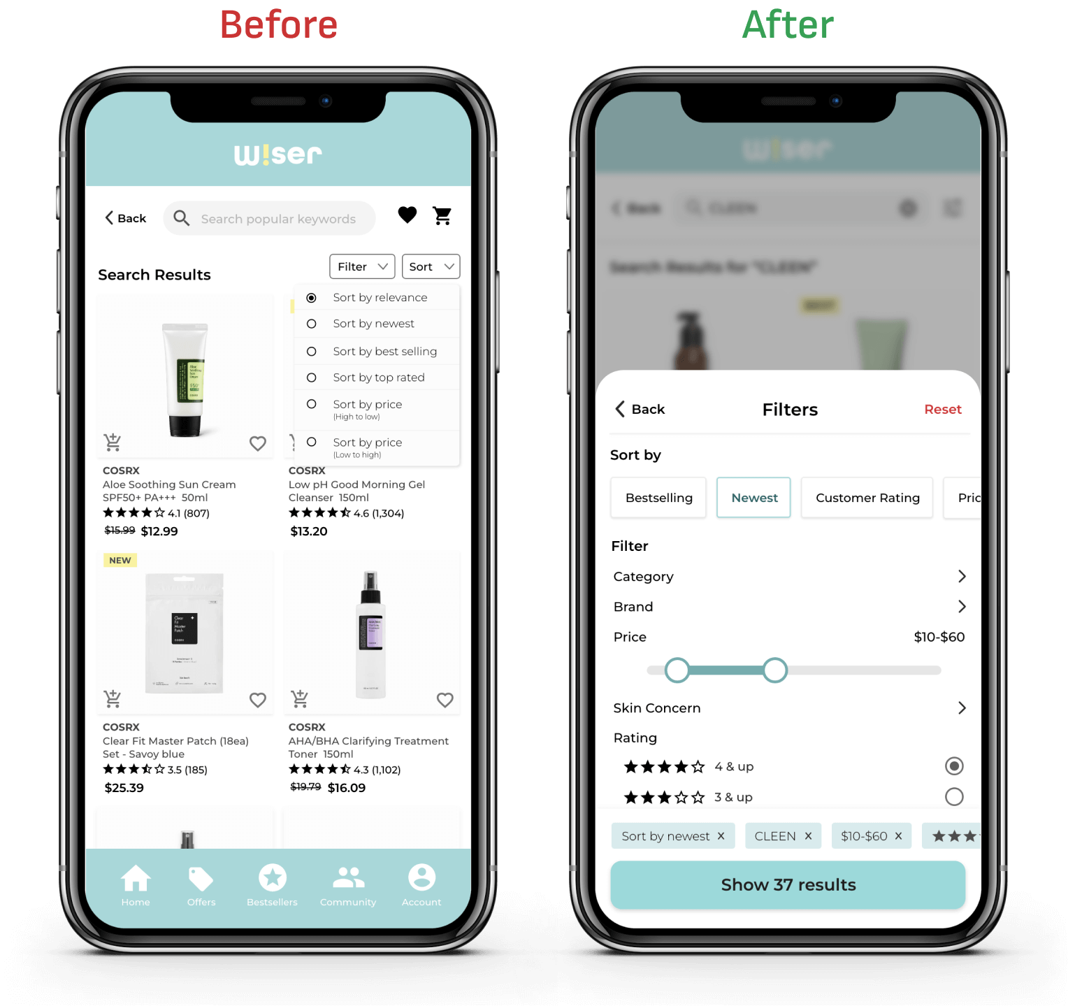
3. A few Users found sort filters difficult to target
Sort filters allow users to control the order of their search results. This was added to provide more efficient user experience. However, few participants complained that sort buttons are too small to find and tap. This contributed to a delay in finishing the task at hand. The button has been redesigned to be big enough for easy tapping, and the filter feature has been enhanced to offer more filtering abilities and better suit the mobile application.
What I learned
My takeaway from working on Wiser has been the realization of the paramount importance of clear communication through design. While a design may seem clear and intuitive to the designer, it might not be as evident to the users. I've come to recognize the existence of designer bias, where I might assume that features make perfect sense from my perspective as a designer, but they might not be as clear to the users. For instance, using universal visual cues like a search icon may not be sufficient; clear explanations through accompanying text are essential, such as 'Find popular keywords using the search feature.'
Moreover, I've learned the significance of breaking tasks down for users and avoiding overwhelming them with too many options, as this can lead to confusion and decision-making difficulties. For example, our initial sign-in screen prominently featured the 'Sign In' button, but the 'Sign Up' option was relegated to small text, resulting in users struggling to find it with difficulty.
Lastly, I've gained a deeper understanding of the distinction between web interface and mobile design. Some designs that are effective on web platforms might not be suitable for mobile devices, so we need to adapt them for mobile users. This experience has taught me the significance of customizing designs to meet the specific needs and limitations of mobile users, ensuring a smooth user experience.
View Other Projects:
